project #1 Balance
in this project we used the aboriginal dot painting style to create our own dot paintings.
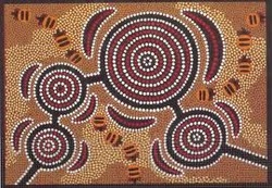
this is what some of
the aboriginal dot
paintings look like.
the aboriginal dot
paintings look like.


ARTIST STATEMENT
In my dot painting I decided to use the asymmetry balance because it seemed fun. I am a nature kind of guy so a lot, almost all of my symbols are the involving nature. I feel that asymmetry was the best type for me so that is why I chose it. to me asymmetry means that a painting doesn't really have a certain patters but it has no free space, its space is used up.
The yellow dots in my painting represents swamp land and I put it right next to the water because it seemed like the right thing to do. The water represents the amount of time that I spend on the water, ether fishing swimming or just in the boat. The people in my painting represent friends and family. The circle thing represents food. Fire represents the campfires we have over the summer.
My painting is different from the aborigines because in mine I really don’t have a certain pattern type. The aborigines have a pattern type as well as a lot of dots… I guess that’s why they are called dot painting haha. The way I see it is that they took their dot painting to heart and I mean I kind of did but nothing like they do.
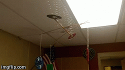
project #2 movement.


ARTIST STATEMENT
This project showed movement because when people walk by the wind from their body is strong enough to love the mobile back and forth. The spring like pieces of wire bounce the mobile up and down and the CD’S and cassettes bounce from side to side. The fact that is able to hang and move at the same time is cool.
The theme for this project was music. We went with a music theme so we could do something that would be quick and still look cool. as we got down to the last couple days the way it was not balanced really made us work harder because we wanted it to be balanced. I am proud of this project because we got it finished and it was on time haha.
The definition of movement is anything that has motion. our project shows movement when people walk by due to the air. our project moves up and down as well as side to side. this project was fun but at the same time it was a little difficult.


project # 3 Emphasis
- In this project we had to create a T-shirt or a poster to celebrate 50 years of Lakeland High school. i came up with the idea of putting all the years from 2014 to 1964 on the back of the shirt saying Lakeland pride decades wide. and on the front I put ' starting in 1964 and still going strong.
this project shows emphasis on the back of the shirt by using contrast in the size of the text and also by the colors.
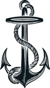
I showed emphasis on the front of the shirt by using isolation because the words are kind of isolated from the anchor. the 5 kinds of emphasis are... Contrast, Location, Unusual, Isolation and convergence.
I know that they use Emphasis in every day life because its all over television and sometimes its very clear. If big name companies want to/need to sell a product they will try and isolate the object and state how the consumer cant go wrong when buying their product. Nissan and other car companies are really bad at using emphasis.


project # 4 Unity.
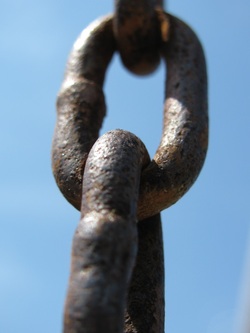
unity is being joined as a whole... some examples of unity are chains, fences, and even shapes can show unity. unity is all around you and you may not even know it. unity can be showed by proximity, harmony of shape and colors.


PROJECT # 5 Variety
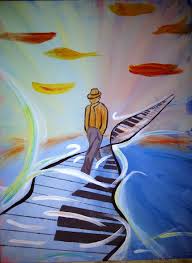
you can use and show variety in many ways such as variety of lines, variety of shapes and variety of color.


